
End-to-end design for an app for parents to obtain help when their child is unwell.
Role
End-to-end UX/UI designer & researcher
Timeline
5 weeks


Problem
Solution
Parents of young children may find it difficult to get timely, adequate help for their children when they are unwell.
Design an app that offers help or suggestions for parents at any time of the day
Research
Goals
We want to know the issues that parents face with their young ones’ health so that we can provide them with solutions that will help.
Objectives
-
Understand how parents navigate the issues that they have to deal with for their little ones’ health.
-
Learn where parents are getting help currently and whether that help is adequate.
-
Determine if there are assumptions or gaps that can be closed.
Key Findings
Motivations
Time, children’s comfort, cost, and safety
Current Practice
Most parents head to the hospital/pediatrician when child is unwell
Parents would prefer to self-medicate at home if possible
Wishes/ Gaps
More information on 24-hour clinics and doctors
Parents/friends who have been through the same issues
Availability of doctors who provide video consultation
Competitor Analysis
By conducting a competitive analysis I was able to gather insights into other clinics and services that offer healthcare support to parents. This helped me to see the gaps and how this app could provide solutions.
White Coat
VALUE PROPOSITION
-
Teleconsultation with experienced doctors
STRENGTHS
-
3 locations; 1 based in Singapore
-
Brand awareness and loyalty
WEAKNESSES
-
Not targeted for children or paediatric-specific
UPAL
VALUE PROPOSITION
-
Online service for parents to seek paediatric support
STRENGTHS
-
Created by KKH (government children’s hospital)
WEAKNESSES
-
Rather cold and unassuring
-
Only covers more common paediatric conditions
Kids Clinic Hidoc
VALUE PROPOSITION
-
Video consultation with 2 renowned paediatricians
STRENGTHS
-
Experienced specialists
-
Well-known "brand" with multiple clinics in Singapore
WEAKNESSES
-
More catered for parents who have brought their children to Kids Clinic before
With these findings, I wanted to fill the gaps that exist in this area. Perhaps we might be able to create an app that offers parents support if their child is unwell. Perhaps we might be able to include a social element that enables them to link up with people facing similar issues.
Define
Target Users
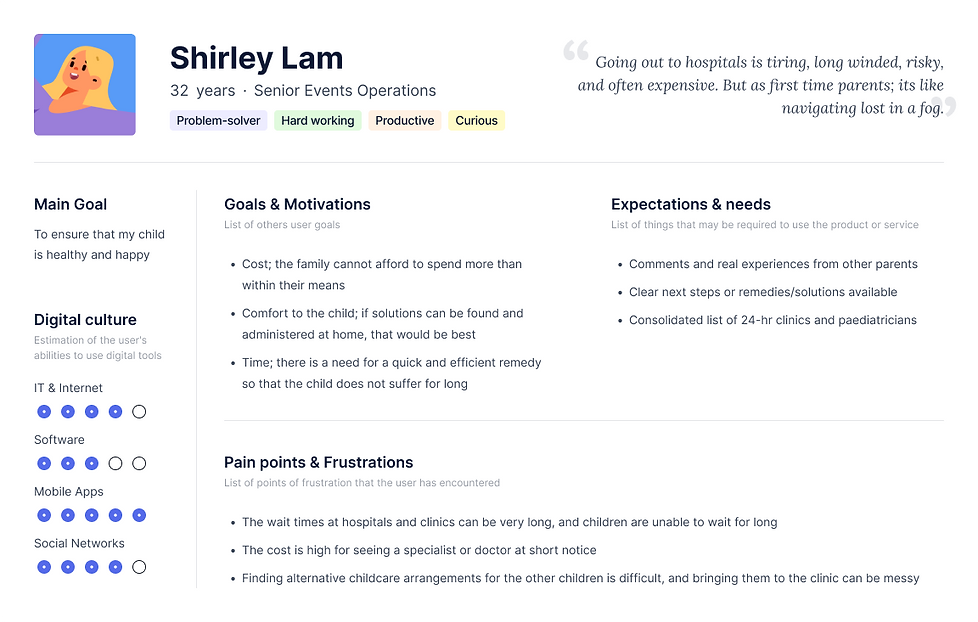
From my research, I narrowed my user persona down to designing for Shirley, a working mother who does not fancy trips to the hospital or clinic.
Tackling the Problem
To strategize and improve the experience for my users, it was helpful to think about some questions.
How might we improve the caregiving experience for parents?
How might we reduce the stress and burden of getting healthcare support especially at unearthly hours?
How might we provide the best support for flustered parents to administer care and support to their sick children?
I would like to find ways to help parents to get the adequate help they need because they want to reduce the time that their children are unwell.
I would like to help parents to know which doctor/clinic to visit so as to remove the additional stresses of wrong diagnoses and delays.
User Flow
This helped me to determine what pages were needed to satisfy user goals and provide a smooth task flow.

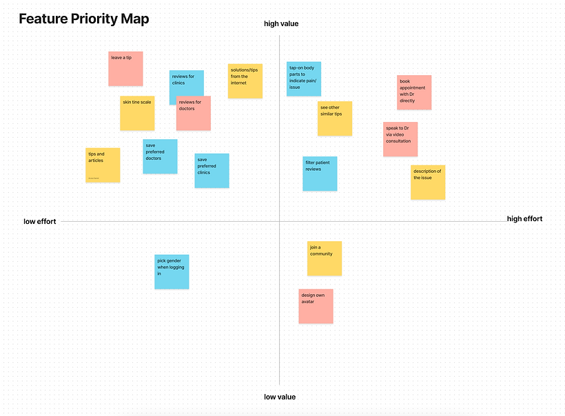
Feature Priority Map
I used a feature priority map to pick the features that should be present in this MVP.
Bringing It Together
Empathizing with the thoughts from various parents surveyed, I was able to derive the needs for the app

Design
Mid-Fi Screens
As I experimented with various designs, I focused on:
-
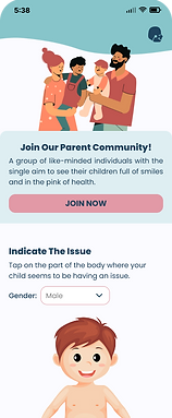
A simple home page
-
Unique interactive design to offer immediate help
-
Easy-to-navigate pages to get quick tips and suggestions
Mid-Fi Wireframes


Branding & Visual Design
Delightful, light, happy, helpful, and interactive.
I wanted the brand identity to embody these values well.
Colour palette:
Childlike and attractive, warm pastel colours.
App name:
Simple and straightforward; the heart's cry of every parent.
Logo:
Vector with an emphasis on the rosy cheek—a child in the pink of health.


High-Fi Wireframes


Tests & Iterations
Usability Testing Insights
Successes
Overall, users enjoyed using the app and felt that it would be very helpful for parents.
"Very clear, very intuitive"
"I love the tap on the body part"
Pain Points
Users highlighted some wordings that were unclear and needed rephrasing.
“Speak to a doctor can be misleading - can I speak to a doctor via the app?"
Suggestions
-
Change profile icon to be more obvious
-
Maybe have a thumbs up and down to rate the tips that work or not
-
Radio button for gender
-
Slider for skin colour indication
Iterations
After prioritizing the revisions, I decided to focus on the following:


-
Limited preview text
-
Thumbs up and down to rate tips
-
Avatar for parents with accounts
-
Clearer profile icon
-
Radio button for gender
-
Slider for skin colour


-
Patients' reviews moved
to the top; prioritizing information
Reflection
Learnings
Being pregnant myself, and surrounded by friends with young children, this app was a dream created to help friends.
It was a fun journey for me to design something different, and also take into consideration what parents thought, rather than depending on my own assumptions as a soon-to-be parent.
Areas of Improvement
As the end-to-end UX/UI designer for the project, I believe there were areas that could have been better handled. If I had more time or a team, I would have interviewed more users and done usability testing with live/virtual sessions.
At the same time, it would be nice if I had customised graphics and images for the app.
The app was appreciated by those who tested it; and it seems to fulfil its function in helping parents with little ones. Over time we would be able to observe the true impact that it makes on parents, and if additional changes need to be made.


