A responsive website for a digital consultancy providing customised services for companies.
Role
End-to-end UX/UI designer & researcher
Timeline
80 hours


Problem
Companies are finding it difficult to hire and retain IT staff. They do not have the technological know-how for steering and future-proofing their companies in this tech age.
Solution
Design a website that helps company leaders to determine the state of their company, and obtain help from industry experts.
Research
User Research
-
Business owners were consulted to gather thoughts
-
Those interviewed were from small and medium enterprises, and those who were experiencing issues with their companies
-
Some business owners cited stress and insomnia resulting from work-related issues and uncertainties
-
Cost, convenience, and reliability were great motivations for business owners
Key Findings
Quality of Service
Most business owners want to know what kind of services will be offered to them, and whether this will be of high quality
Convenience
Business owners want an option that does not pose too many changes or affect too much of their daily operations
Pain Points
These varied from business to business; but most companies cited having trouble finding a head of IT, and retaining IT team members
Competitor Analysis
Accenture
VALUE PROPOSITION
-
Digital consultants who become trusted advisors to the company
STRENGTHS
-
Based in Singapore
-
Brand awareness and loyalty
WEAKNESSES
-
More focussed on large companies and not SMEs
Defended Solutions
VALUE PROPOSITION
-
Provides secure communications solutions
STRENGTHS
-
Experienced in the field
-
Worked with name brands
WEAKNESSES
-
Based overseas
Centric Consulting
VALUE PROPOSITION
-
Partners both big and small businesses to chart the path forward
STRENGTHS
-
Experienced in the field
-
Worked with name brands
WEAKNESSES
-
Based overseas
With these in mind, the client wanted to create a website to help small and medium-sized businesses with their digital transformation. Perhaps we might be able to add in a quiz that allows owners to rate their companies and identify the type of services or help that they would require from SHIFT. Perhaps we could also include success stories to inspire business owners.
Define
Target Users
With the data points gathered, I had a better idea of what a company owner would need from the SHIFT website. I focused on 1 persona.

Tackling the Problem
To help my client truly benefit their users through this app, it was helpful to think about some questions together. This helped us to align the strategy we wished to employ for the project.
How might we help company leaders feel confident that their businesses are secure for the future?
How might we provide the best support for company leaders to lead effectively?
How might we reduce the stress and burden on the IT teams?
User & Task Flows
I worked with the client to create a user flow and two task flows that best suited the purpose of the site.

Bringing It Together
Keeping in mind the thoughts and sentiments of the company owners, as well as the clients' business goals, I was able to derive the needs for the site.

Design
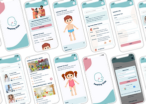
Mid-Fi Screens
To start out, I presented the client with 1 page from 5 different sections to ensure our alignment and confirm the direction we were headed towards.
Mid-Fi Wireframes


Mid-Fi Responsive Screens


Branding & Visual Design
Professional, relatable, cutting-edge.
These were some values that we thought best represented the company and how it carried itself.
Colour palette: Non-stereotypically tech colours, modern
The client agreed that they helped to accentuate the relevance and down-to-earth nature of the company; and its willingness to reach out to each and every customer.


High-Fi Wireframes


High-Fi Responsive Wireframes


Tests & Iterations

User flow

Usability

Design/Colour
Usability Testing Insights
Successes
Overall, users mentioned that the site was easy to navigate.
"It's good. Clear and east to use."
"Nice colours and fonts to separate the secionts'"
Pain Points
Users suggested changing the positioning of some content to help the user flow and direct users to the assessment.
“I wouldn't click (on stories) until I scroll further and understand a bit more"
Suggestions
-
Summarize "About Us" page further (too wordy)
-
Change main CTA button to a consistent banner on each page
-
Increase padding and line spacing
-
Move "back" button to the top of the screen for familiarity
Iterations
Based on the feedback I received, and after prioritizing the revisions with the client, we decided to focus on the following changes:

-
Edited wording for CTA button
-
Carousell with logos of client companies
-
Increased line spacing and padding between text blocks
-
Coloured box added to act as a visual break


-
Main CTA button changed to a sticky bar on every page
-
Summarized text
Reflection
Learnings
I began this project with the client wanting to create a site that could help them at networking events and when they meet other company owners.
It was a unique journey for me to work with a client and to have to keep their thoughts and considerations in mind while designing. Learning to balance their feedback and also to explain and validate the reasons for my choices were key learnings for me from this project.
Areas of Improvement
As the end-to-end UX/UI designer for the project, I believe there were areas that could have been better handled. If I had more time or a team, I would have interviewed more users and done testing with more users who fit the persona.
If I were to do this again, I would also have a chat with the clients about their expectations prior to beginning the project. This would have really helped to create alignment and ensure a smooth process.
This site seems to be liked by those who tested it, and it seems to be able to bridge the gaps in the areas of staff welfare and company competency for company owners. Only time will tell if it works as planned for the company owners and whether more features could be added to the site.