
UI design for a one-stop app created for women; to browse and book many different services.
Role
UI designer
Timeline
3 months

Understanding the
Problem
Women, both working and stay-home mothers, find it difficult to engage services to help with chores. The 21st century woman differs from women of the past, and they take on a huge mental load while having to wear many hats on a daily basis.
Solution
Design a one-stop app that consolidates different services and allows for booking appointments easily.

Research Gathered
The client wanted to fill the gaps that exist in this area. Together, we wanted to create an app that streamlines processes for them to access necessary services for their daily needs.
Define
Target Users
From the client's research, we narrowed down our user persona; choosing to design for Mei Ling, a housewife who does not fancy trips to the car mechanic.

I would like to find ways to streamline the booking process for services because women want to accomplish more with their time.
Ideate
Tackling the Problem
To help improve the experience for the user, it was also helpful to think about some questions.
How might we simplify the process of searching and booking services for users?
How might we empower women by easing their daily mental load and taking some tasks off their hands?
Journey Map
Visualising the user experience through a journey map enabled me to put myself in the user's shoes; and ensure a positive experience through the additional feature.
Scenario: Mei Ling is busy with her usual responsibilities and chores. One day, she finds herself needing to send the car for servicing amidst everything else that needs to get done.
Expectations:
- Services/chores are taken care of so that she can focus on more important tasks that only she can do

User Flow
I created a user flow to determine what pages were needed to satisfy user goals and provide a smooth task flow. These were approved by the client before the design process began.

Design
Mid-Fi Screens
As I experimented with various designs, I presented these 5 screens to the client first. The aim was to have a simple interface that shows the user the various types of services and categories available to them.
Mid-Fi Wireframes


Branding & Visual Design
Easy, helpful, and aesthetic.
The client wanted the brand identity to embody these values.
Colour palette:
Feminine and attractive.
Typeface:
Versatile, and easy on the eyes.

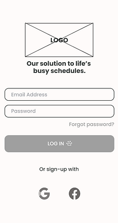
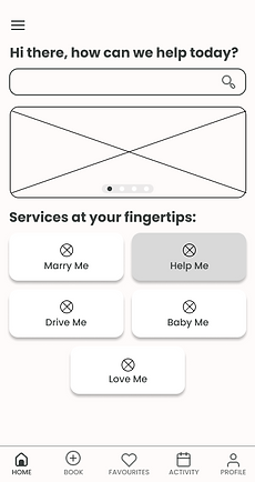
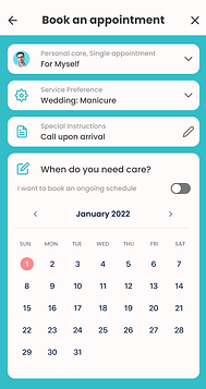
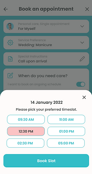
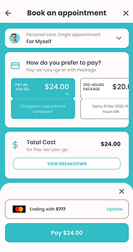
High-Fi Wireframes


Reflection
Learnings
Through working with my client, I learnt that the client's needs come first. Because of this, I found myself learning how to articulate and explain my design decisions to the client.
Areas of Improvement
As I was only the UI/ visual designer on this project, I was not able to do the research or plan the user journey as I would have liked to. It would have been great if I had the opportunity to work with the UX designers and researchers before designing the interface. It would also have been helpful to speak directly with the developers to collaborate on creating the best experience while not compromising on good design.
Client's Feedback
"Will be definitely be back for more! Aruna is friendly and professional and very efficient and fast at what she does 😊
Super efficient and fast speeds and very good rendering with initiative. My third time using her services for my app’s UI and it’s amazing! Can’t do it without her"


